More than half of all web traffic in Africa comes from mobile devices. In Ghana alone, mobile accounts for 56.71% of web traffic (StatCounter, February 2026). If your website does not work well on a phone, you are invisible to the majority of your potential customers.
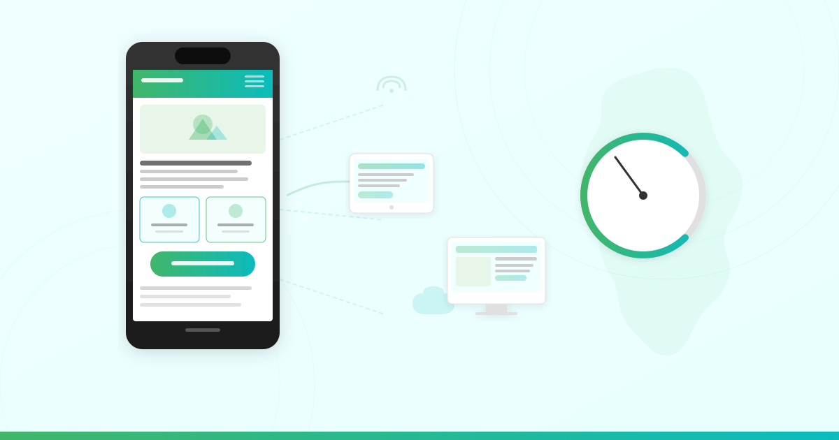
Mobile-first web design is the practice of designing your website for mobile screens first, then scaling up for larger devices. For African businesses, this is not a trend. It is a fundamental requirement.
This guide explains what mobile-first design means, why it matters for businesses across Africa, and exactly how to build a website that delivers a fast, seamless experience on every phone.
What Is Mobile-First Web Design?
Mobile-first design means you start the design process with the smallest screen in mind. You build the layout, content, and navigation for a phone first. Then you progressively enhance the experience for tablets and desktops.
This is the opposite of the traditional approach, where designers create a full desktop layout and then shrink it down for mobile. That shrink-to-fit method often produces cluttered mobile experiences with tiny text, broken layouts, and slow load times.
With mobile-first design, every element earns its place on the small screen. The result is a clean, focused experience that works for every visitor, regardless of their device.
Mobile-first vs. responsive design: Responsive design means your site adapts to any screen size. Mobile-first design is a specific strategy within responsive design where you begin with mobile and build up. A responsive site is not automatically mobile-first if it was designed desktop-first and merely rearranged for phones.

Why Mobile-First Design Matters for African Businesses
Africa is not just adopting mobile internet. Africa is leading with it. Here is why your business cannot afford to ignore mobile-first design.
Mobile Devices Dominate Web Traffic
Across the continent, mobile devices account for 58.26% of all web traffic (StatCounter, February 2026). In Ghana, 24.3 million people use the internet, with 93.4% of mobile connections running on broadband networks (DataReportal, 2025).
Sub-Saharan Africa is expected to account for nearly a quarter of all new mobile internet subscribers globally between 2025 and 2030 (GSMA Mobile Economy Africa). Your next customer is almost certainly browsing on a phone.
Data Costs Shape User Behavior
Mobile data in Sub-Saharan Africa remains a significant expense for many users. When a visitor opens your site on a phone, every megabyte counts.
A bloated website with oversized images and heavy scripts wastes your visitor’s data budget. They leave. A lean, mobile-first site loads quickly and uses less data, keeping visitors engaged and your bounce rate low.
Google Uses Mobile-First Indexing
Google now uses mobile-first indexing for 100% of websites (Google Search Central). This means Google primarily uses the mobile version of your site to determine your search rankings.
If your mobile experience is poor, your site drops in search results. If your mobile site is missing content that exists on your desktop version, Google may not index that content at all. For businesses trying to get your website on Google, mobile-first design is now an SEO requirement.
Slow Sites Lose Customers
According to Google, if a page takes longer than 3 seconds to load, 53% of mobile visitors will leave. The probability of a bounce increases 32% when load time goes from 1 second to 3 seconds.
For every second of delay in mobile page load, conversions can fall by up to 20%. A slow website does not just frustrate visitors. It costs you revenue.
How to Build a Mobile-First Website
Building a mobile-first site does not require advanced technical skills. Follow these practical steps to get it right.
1. Choose a Mobile-Responsive Theme
If you use WordPress, your theme determines how your site looks on mobile. Choose a theme built with responsive design from the start.
With LUMINWEB’s hosting plans, you get Softaculous one-click installer, which gives you access to WordPress and 400+ other applications. After installing WordPress, pick a theme labeled “mobile-responsive” or “mobile-first.” Popular free options include Astra, GeneratePress, and OceanWP.
Test your theme on an actual phone before going live. What looks good in a desktop preview may not translate perfectly to a 6-inch screen.
2. Optimize Your Images
Images are the biggest contributor to slow mobile load times. Every unoptimized photo forces your visitor to download megabytes of unnecessary data.
To optimize images for mobile:
- Compress images before uploading using tools like TinyPNG or ShortPixel
- Use modern formats like WebP instead of PNG or JPEG where possible
- Set explicit image dimensions to prevent layout shifts while loading
- Use lazy loading so images below the fold load only when the visitor scrolls to them
A WordPress plugin like Smush or ShortPixel handles most of this automatically. For more ways to boost your site speed, read our guide to web hosting performance optimization.
3. Prioritize Fast Hosting
Your hosting infrastructure directly affects how fast your mobile site loads. A slow server means a slow site, no matter how well you optimize your code.
Look for hosting powered by modern cloud infrastructure with SSD or NVMe storage, a free CDN (Content Delivery Network) that serves your content from locations closer to your visitors, and server-level caching that reduces load on every page request.
LUMINWEB’s hosting runs on Google Cloud infrastructure with SSD storage and free CDN included on all plans. This means your site loads fast for visitors in Accra, Lagos, and Nairobi — not just visitors near a single data center. Explore LUMINWEB’s Shared Hosting or WordPress Hosting to get started.
4. Design for Touch, Not Clicks
Mobile users tap with their fingers, not a mouse cursor. Your design needs to account for this.
Make tap targets (buttons and links) at least 48×48 pixels. Space interactive elements apart so users do not accidentally tap the wrong link. Use a hamburger menu or simplified navigation that works with one thumb. Avoid hover-dependent interactions — they do not exist on touchscreens.
5. Use Readable Typography
Body text should be at least 16 pixels on mobile. Anything smaller forces visitors to pinch and zoom, which signals to Google that your site has mobile usability issues.
Use high contrast between text and background. Stick to 1-2 font families to keep your design clean and your page load fast.
6. Minimize HTTP Requests
Every file your page loads (CSS, JavaScript, fonts, images) creates an HTTP request. More requests mean slower load times, especially on mobile networks.
Reduce requests by combining CSS and JavaScript files where possible, removing unnecessary plugins and scripts, using a single font family loaded from your server rather than multiple Google Fonts, and deferring non-critical JavaScript so it loads after the main content.

Tools to Test Your Website’s Mobile Performance
You do not need to guess whether your site performs well on mobile. Use these free tools to measure and improve.
Google PageSpeed Insights
Visit pagespeed.web.dev and enter your URL. PageSpeed Insights scores your site from 0-100 for both mobile and desktop. It flags specific issues like slow server response, render-blocking resources, and oversized images.
Focus on the mobile score. Google simulates a mid-tier phone on a mobile network, which reflects how most of your African visitors experience your site.
Chrome DevTools Device Mode
Open Chrome, press F12, and click the device toggle icon. This lets you preview your site on different phone screen sizes. Test on popular devices like the Samsung Galaxy A series and Tecno phones that dominate the African market.
GTmetrix
GTmetrix provides a detailed waterfall chart showing exactly which files slow down your page. The free tier lets you test from multiple server locations.
Google Search Console Mobile Usability
If your site is verified in Google Search Console, the Mobile Usability report flags pages with issues like text too small to read, clickable elements too close together, and content wider than the screen. This is the most direct signal of what Google sees when crawling your mobile site.
Common Mobile-First Design Mistakes to Avoid
Even well-intentioned redesigns can miss the mark. Watch out for these common pitfalls.
Hiding Content on Mobile
Some designers hide sections on mobile using CSS `display: none` to simplify the layout. This harms your SEO because Google’s mobile-first indexing may not see that content. If content is important enough to show on desktop, make it work on mobile instead of hiding it.
Using Pop-Ups That Block the Screen
Full-screen pop-ups on mobile are frustrating for users and penalized by Google. If you need a call-to-action overlay, use a small banner that does not block the main content.
Ignoring Page Speed
A beautiful mobile design means nothing if it takes 8 seconds to load. Performance is part of design. Test your load time with PageSpeed Insights after every significant change.
Not Testing on Real Devices
Emulators are useful, but they do not capture real-world conditions like network throttling, device-specific rendering quirks, and actual touch interactions. Test your site on at least 2-3 real phones before launching.
Forgetting About Offline and Low-Connectivity States
Many African mobile users experience intermittent connectivity. Consider implementing a service worker for basic offline functionality, or at minimum, ensure your site degrades gracefully when the connection drops mid-load.
How Your Hosting Affects Mobile Performance
Your web design is only half the equation. The server behind your site determines how fast that design reaches your visitor’s phone.
Three hosting factors directly impact mobile performance:
Server response time: Google recommends under 200 milliseconds. Cloud infrastructure like Google Cloud delivers consistently fast response times compared to traditional shared servers.
CDN (Content Delivery Network): A CDN caches your site’s static files on servers around the world. When a visitor in Kumasi loads your site, they get files from a nearby server instead of waiting for data to travel across continents. LUMINWEB includes a free CDN with every hosting plan.
SSL/TLS: HTTPS is required for security and SEO. LUMINWEB includes free SSL certificates on all plans, so your mobile visitors see the secure padlock icon without any extra cost.
When you build your business website, choosing the right hosting is as important as choosing the right design. A mobile-first site on slow hosting still delivers a poor experience.
For sites that need even faster performance and dedicated resources, VPS Hosting gives you full control to optimize your server specifically for mobile speed.
Build for Mobile, Build for Africa
Africa’s internet is mobile-first. Your website needs to be too.
Start with a mobile-responsive theme. Optimize your images. Choose hosting that delivers fast load times across the continent. Test your site with the free tools listed above. And avoid the common mistakes that undermine even the best designs.
The businesses that build for mobile today are the ones that reach Africa’s growing online audience tomorrow.
Ready to launch a fast, mobile-first website? Explore LUMINWEB’s hosting plans — powered by Google Cloud, with free CDN, free SSL, and one-click WordPress setup. No surprises, no hidden fees. Your trusted hosting partner, built for African businesses.
